Guide / 7 min read
The Anatomy of B2B Landing Pages That Convert
What works, what doesn't, and why

Asger Teglgaard
January 20, 2026
“Next-Generation Marketing Automation Platform”
That was the headline. I was reviewing a client’s landing page and I read it out loud. Then I asked them what it meant.
Silence.
They’d spent three months building this page. Custom illustrations, animated demos, testimonials from real customers. The design was beautiful. But the first thing any visitor read was seven words that said absolutely nothing.
The average B2B landing page converts at 2-5%. The ones that hit 10-15% aren’t better designed. They’re better written.
What I keep seeing on pages that work
After reviewing hundreds of landing pages, the patterns are boringly consistent.
The headline is specific
“Send 10x more emails without hiring anyone” beats “Next-Generation Email Platform” every time. The difference isn’t cleverness. It’s specificity and outcome.
Read your headline to someone who’s never seen your product. If their response is “so what?”, rewrite it.
Social proof is above the fold
B2B buyers are risk-averse. They want evidence before they invest attention. Logos, a specific metric (“helped 500+ companies”), or a one-line testimonial, all within the first screen.
The CTA says what it does
A page offering a whitepaper with a button that says “Get Started” is a conversion killer. Say what clicking does. “Download the Guide.” “Book a 15-min Call.” “Start Free Trial.” Match the button to the ask.
Benefits before features
Here’s the reframe I do with every client:
| Feature | Benefit |
|---|---|
| AI-powered analytics | Know what’s working without data science skills |
| Native integrations | Your tools finally talk to each other |
| Real-time dashboards | Make decisions with today’s data, not last month’s |
Most B2B pages lead with what the product does. Winners lead with what the buyer gets.
Things I keep seeing go wrong
The 10-field form
A client had a 10-field form on a whitepaper landing page. They wanted job title, company size, revenue range, phone number. The whitepaper was 4 pages long.
Each additional field typically reduces completion by 5-10%. They were asking for a marriage commitment on a first date. We cut it to three fields. Conversions doubled.
Ask only what you need for the next step. Qualify later.
The escape hatch
Your landing page has one job. Full site navigation gives visitors fifteen ways to leave before they convert.
Remove the nav. One page, one path, one action.
High-converting pages strip everything that doesn’t serve the conversion. Privacy policy link at the bottom. That’s it.
The stock photo handshake
“Business people shaking hands” signals “we have nothing real to show you.” Use product screenshots, customer photos, or nothing at all. Clean design with no image beats a generic stock photo every time.
The wall of text
Nobody reads landing pages word by word. They scan. Short paragraphs, bold key phrases, clear visual hierarchy. If your page looks like a Terms of Service document, people will treat it like one, by not reading it.
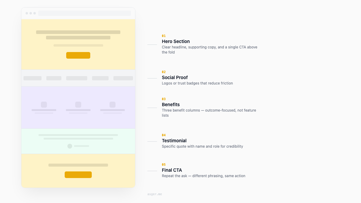
Structure that converts
Pages that consistently perform above 10%:
First screen: Outcome-focused headline, supporting subhead that explains the mechanism, primary CTA, social proof, optional product visual.
Below the fold: Problem section (why they need this), solution section (how you solve it), benefit breakdown, detailed social proof, FAQ that handles objections, secondary CTA.
If you can only test three things
Headlines first. Highest impact, easiest test. Try three variations that frame the same product differently.
CTA copy and design. Button text, color, placement. Small changes, surprisingly large effects.
Form length. Try removing fields. Every field you cut is a gift to your conversion rate.
Run one test at a time. Wait for statistical significance. Changing everything at once tells you nothing.
I do Landing Page Rebuilds: annotated redesign in Figma plus a video walkthrough explaining every change. Not advice. Actual design work you can hand to your team.